UX Design Intern
Samsung Research Institute, Bangalore
Mentors Satish Patil, Trivikram Annamalai, Vaibhav Vyas
Deliverable Conceptualize a design philosophy for Tizen OS
Duration May - Jul'17
Project brief
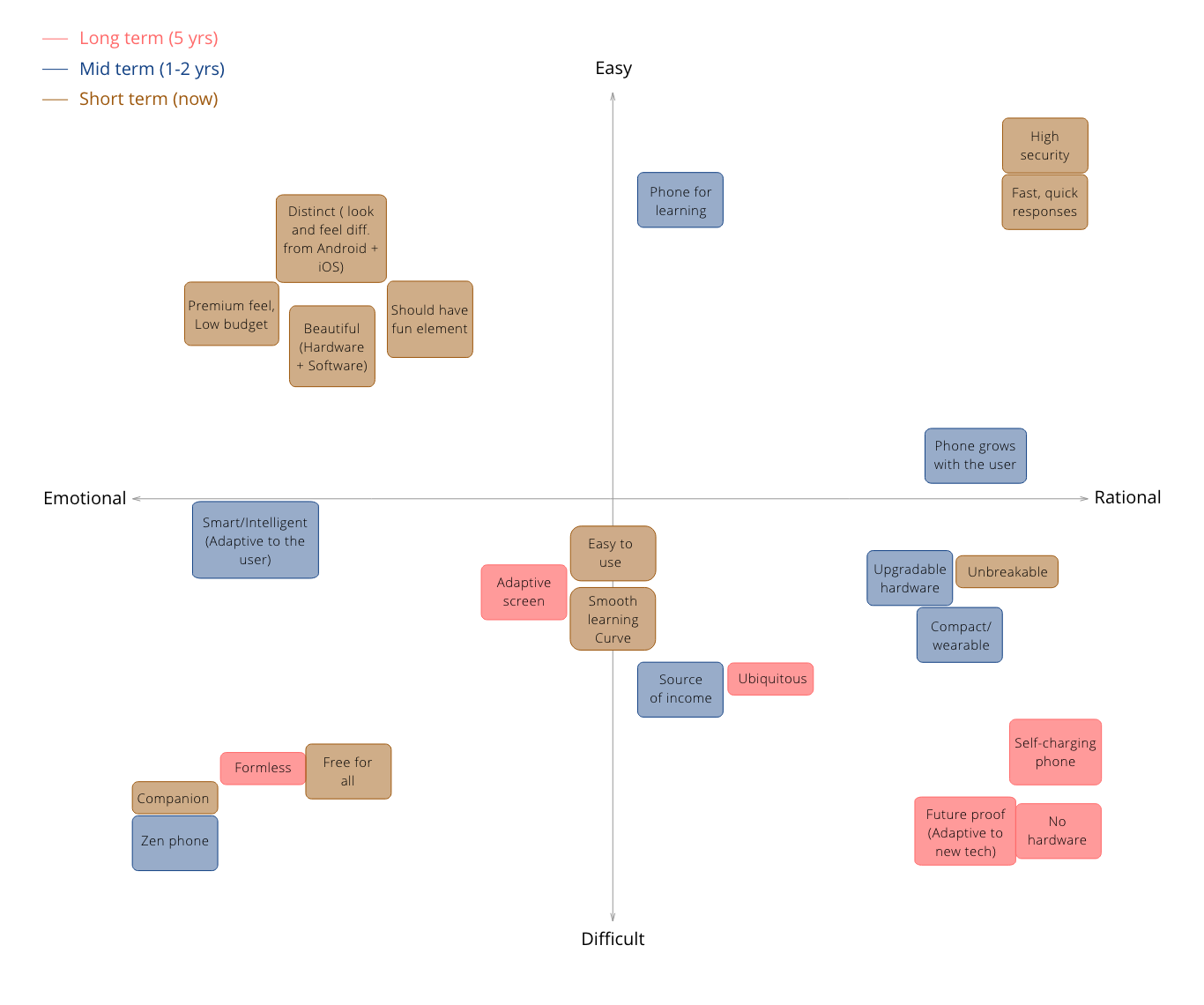
Initial - Develop a USP for Tizen OS: Make a unique selling point for Tizen which would help establish the OS
amongst target users who are shifting from feature phone to smartphone. Design a niche story / philosophy for
the same.
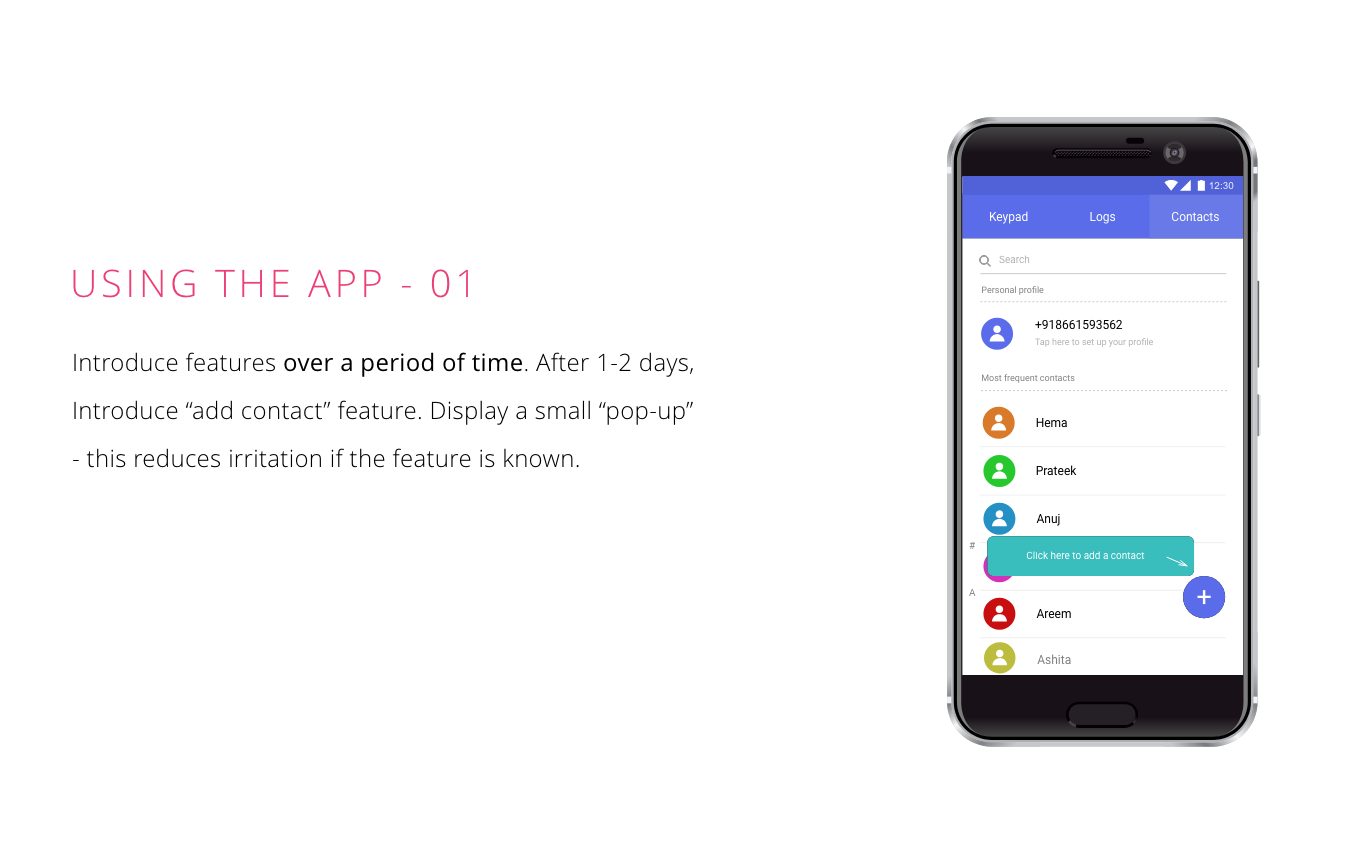
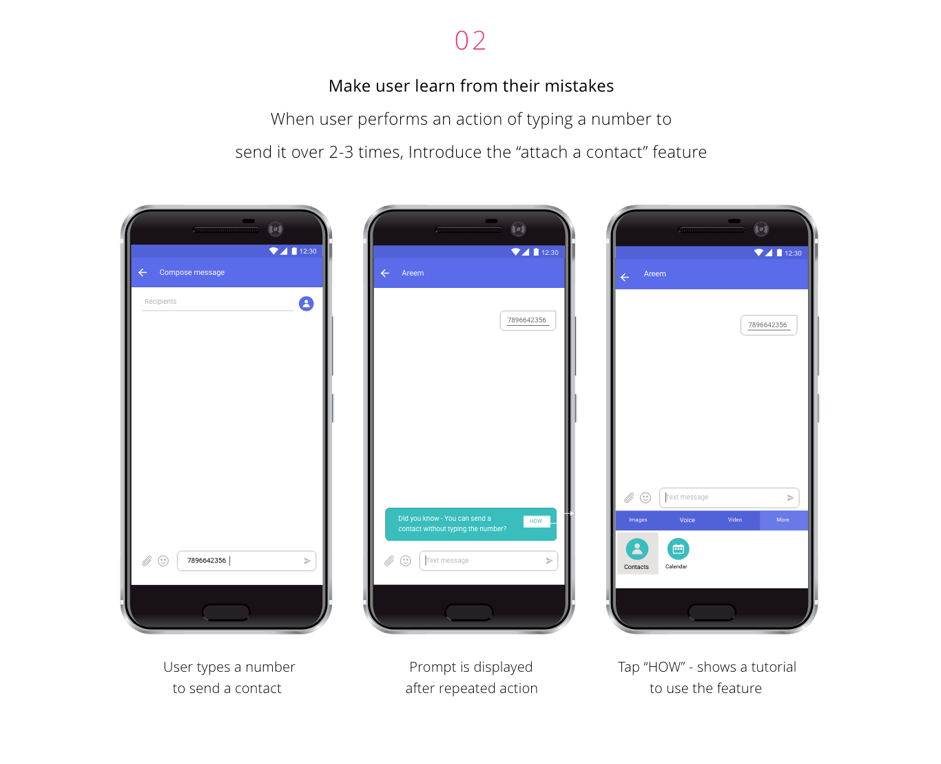
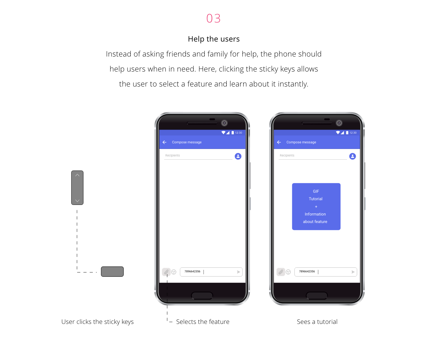
Final - Design a method to educate the user to use a new app or feature: Increase the discoverability of features,
the ease of use and reduce cognitive load on the user.
The following project is a personal work done under the guidance of mentors. User research was performed as a personal initiative and several brainstorming sessions were organized by gathering people from different departments.
Secondary research
Our target users were people in the tier-2 and tier-3 groups shifting from feature phones to smartphones. Several
research papers were analysed for developing countries. Users included men and women from literate, illiterate
and semi-literate backgrounds. For these users, even basic tasks like making calls, saving contacts and viewing call
logs were a challenge.
1. Graphical interface - Difficult for novice users
2. Textual interface - Problematic for low literate users
3. Voice input - Comfortable but needs multi-lingual capability
Potential areas
- Small Business Owners: Use mobile phone for business,
online portals, E-commerce
- Offline/Minimal connectivity: Users try to save data hence many
apps like Google Docs, etc. are using offline mode
- Agriculture: Farmers use mobile phones
to connect with distributer,remove middlemen, and easilyaccess financial services
- Adolescence: There is a gap in the use of
mobile phones by adolescents and parent’s concerns of them accessing the internet
- Entertainment: Offline gaming, Cloud services
for music streaming, mobile is used as replacement of TV
- Multi-lingual need: 70% India’s population lies
in rural area. 1.08 bln population counts regional languages as their 1st, 2nd and 3rd language
Competitor analysis
ANDROID ONE
WHY DID THE OS FAIL?
- USP - Software updates: Failed approach “Get better battery
life, lose the known look and feel of UI”
- Rural India: Did not sell offline in
rural areas - a major target
- Brand matters: Partnered with cheap low-end
companies, taken as “cheap” phone
- Devices: Released in three phones, all
three had the same hardware, only diff was brand name - confusion
- Inconsistencies: Did not implement all
that was promised to users
- Competition: Moto E and Xiaomi
were a good competition
ANDROID GO
Lightweight OS for the most basic smartphones
WHY IT MAY SUCCEED?
- Built specifically with low-end
devices in mind <= 1GB RAM
- Concept is to reach an additional billion users
- The Operating system is highly optimized, making data affordable . It is built on cheap devices, has linquistic flexibility and easier data management
- It is supported by optimized apps in Playstore
CAN IT POSSIBLY FAIL?
- Focusing on low-end market. Might be perceived as “cheap phone”
- Has good competition with Xiaomi MIUI
- Is the selling point: aimed at <= 1GB RAM good enough for the users?
- Still software is the USP (For Indians, software is comparatively less important)
More competitors analysed
User interviews
A user study was done to understand how our target users interacted with a basic Contacts application. I wanted
to find out the core problems they face in switching to a smartphone. Insights from these interviews were used
to develop a philosophy for Tizen OS.
User demographics:
Number: 7 users Age: 25-40yrs
Smartphone users: 6 Feature phone users: 1
Users using English in phone: 7
The questionnaire aimed on the following:
1. Get an idea of user awareness about different features
2. Identify user problems during ongoing call
3. Analyze financial status of user
4. Identify user
frustration areas
5. Understand everyday
phone usage
User statements
- "Smartphone requires lot of patience to learn all the features"
Users need a phone with smooth learning curve
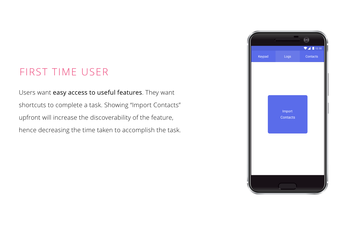
- "Everything should be available in shortcuts so that I save time"
Users need easy access to features
- "I miss out important info on a call while I drive. Call recorder would help me"
Users need an easy method to record missed out info
during a call
- "Now that I know about Speed dial, I will be happy to use it, this is much easier"
Users need better discoverability of useful features
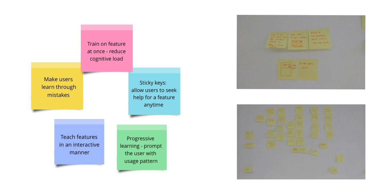
Ideation
Insights
- Users should understand
the benefits of the app
- Users need motivation
to learn
- Make the user feel
the app as necessary
- Make users learn
through activities
Design philosophy
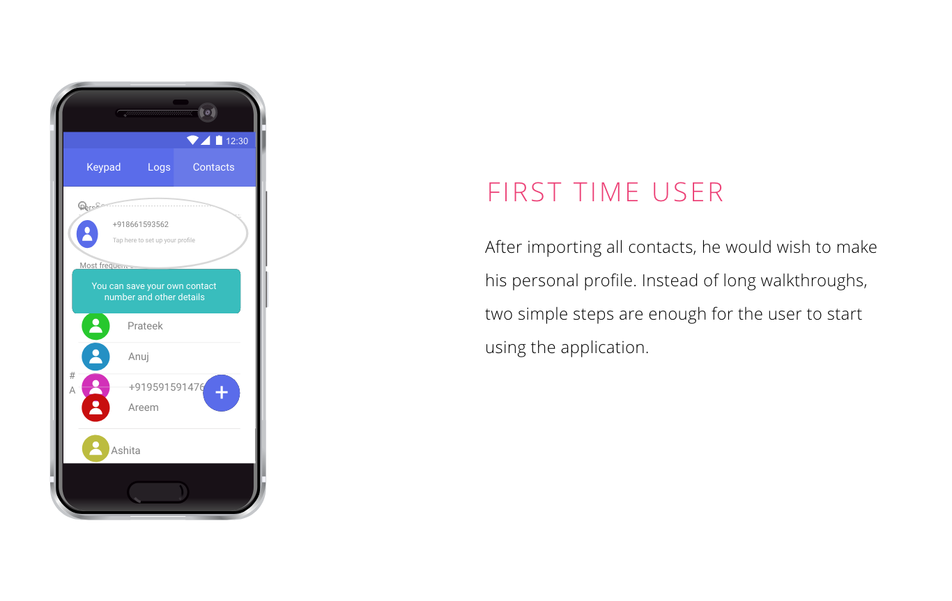
“A phone that adapts to the user patterns and educates users about
useful features
in an interactive way, hence making the phone easy to use”
Challenges and learnings
My first industrial experience built my personality and introduced me to corporate culture. I wish to share some of the challenges I faced during this journey:
- Given a broad overview of the problem area, converging to a detailed problem statement was difficult. The only way to understand the problem area was to talk to users directly and incorporate my findings from secondary research to frame a design problem statement. Having less time and budget for a field study, I took an initiative to recruit N=7 low-mid class workers in the Samsung office as my users. These were the kind of users Tizen OS was aiming for.
- I was good at researching topics and competitive analysis but converting it to meaningful insights was my weakness. I took help from my mentors, observed various other researchers and built this skill during the internship. I participated in small challenges with my mentor and assessed my performance in this area.


